
Electricity Markets 101: Reading the Texas Grid Through Data

Note: All prices, load figures, and curves in this post come from ERCOT public data (15-minute settlement point prices and hourly system load), ingested and modelled in Databricks for this project. Numbers are from my processed dataset and may differ from official ERCOT settlements or nodal results. HB_NORTH broadly represents the Dallas/Fort Worth region.
I’ve spent the last few months pulling energy market data into Databricks, mostly because my interest has been piqued when it comes to commodity trading and energy markets, especially given some of the uncertainty in the Middle East. I think each commodity is intriguing in its own way, along with the various market factors that influence its price and availability. Electricity markets, though, have really captured my attention, for a few reasons we’ll get into in this blog.
My last post on the spark spread dug into one specific trading signal. This one backs up a few steps and covers the fundamentals.
This is the 101 I wish someone had handed me when I started learning.
I’m going to cover some electricity market fundamentals through ERCOT, the grid operator for most of Texas. Electricity markets are regional and they all clear a little differently, so trying to explain “electricity markets” in the abstract gets vague fast. Texas is the best one to learn on, and I’ll get to why.
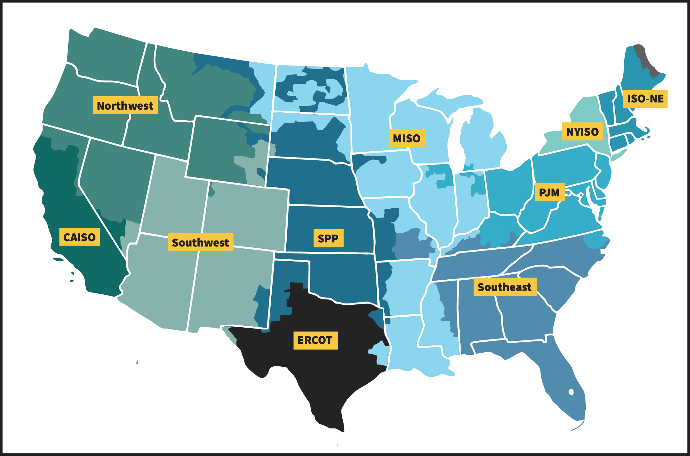 The organized wholesale electricity markets across North America. Each RTO/ISO runs its own market with its own rules, and ERCOT covers most of Texas as its own island. Source: FERC, RTOs and ISOs.
I am also using the Databricks Free Edition for some of the data analysis. So for anyone wanting to get started in this space, there has never been a better time to start. ERCOT has a really solid API to pull this data.
Why electricity is a strange commodity
You can’t easily store electricity at grid scale. Batteries are growing fast on the Texas grid and they ‘added nearly 1,500 megawatts of battery storage to the grid’s summer rated capacities in 2023’, but they still cover only a small slice of demand, and only for a few hours at a time. It can also be very expensive to transmit over long distances, and as a result the USA does not have a national electricity market. Instead, it has a collection of small regional markets, each with its own regulation and characteristics.
Other commodities like crude can more ‘easily’ be stored. A barrel of oil sits in a tank until someone wants it. A warehouse full of gas can wait for winter. Electricity doesn’t work like that. The moment it’s generated, it has to be consumed, and supply has to match demand on the grid every single second of every day. Too much supply and the frequency climbs. Too little and it drops. Drift far enough either way and equipment trips offline to protect itself, which is how you get a blackout. The grid has a sort of ‘heartbeat’ or frequency that dictates how alternating current (AC) changes direction. In North America, this heartbeat pulses at a nominal 60 Hz. When I started reading about how this works, my mind was blown that the grid is even able to run at all given the level of coordination required by power plants.
So somewhere, right now, an operator is balancing generation against demand in real time. In Texas, that’s ERCOT.
That single constraint, supply equals demand every second, is the reason the data looks the way it does:
- It’s high frequency. Prices settle every 5 to 15 minutes, not once a day, because the balancing act never stops.
- It’s volatile. When the grid gets tight, prices don’t nudge, they explode. I’ll show why in a minute.
- It’s locational. Where power is produced and consumed matters, because the wires between them have limits.
Regulated or deregulated: two ways to run a grid
That line about “each with its own regulation” is worth thinking about for a second, because there are really two models for how a region runs its power, and they behave very differently.
In a regulated market, one vertically integrated utility owns the whole chain, from the power plants to the transmission lines to the wires running to your house. It’s a monopoly, and in exchange a state regulator (a public utility commission) approves what it’s allowed to charge. You don’t pick your provider, you get whoever owns your area, and your rate is set through a regulatory process instead of a live market (EPA, Power Market Structure).
A deregulated (or restructured) market breaks that chain apart. Generation becomes competitive, so many companies build plants and bid against each other to sell their power, while the wires stay a regulated monopoly, since nobody is going to string a second set of transmission lines just to compete (RFF, US Electricity Markets 101). And at the far end, retail choice lets you pick who you buy from. Roughly 18 states plus Washington DC have opened up retail electricity this way.
Texas went about as far down the deregulated road as any state. Senate Bill 7 restructured the market effective January 2002. Utilities had to split generation from delivery, competitive Retail Electric Providers started selling straight to customers, and ERCOT was handed the job of running both the wholesale and retail market. In most of Texas there’s no default utility, you have to choose a provider. That competitive, market-driven design is exactly why ERCOT produces the rich, public, high-frequency price data this whole post leans on.
Who runs the market
ERCOT (the Electric Reliability Council of Texas) plays two roles at once. It’s the grid operator keeping the lights on, and it’s the marketplace where electricity gets bought and sold.
A few things make it the right market to learn on. For starters, it’s an island. Texas runs its own interconnection with barely any ties to the rest of the US grid, so it’s one operator and one footprint with very little leaking in or out, about as clean a mental model as you’ll find. It’s also energy-only. Some markets pay generators just to exist and stay available through a separate capacity market, and ERCOT mostly doesn’t, so the price you see is the whole signal rather than half of it.
ERCOT is also famously dramatic. Prices can sit near $25/MWh on a mild afternoon and slam into the $5,000/MWh cap during a heatwave, and Winter Storm Uri in 2021 is the cautionary tale everyone in this space knows. Best of all for someone like me, the data is public and good. ERCOT publishes load, prices, and forecasts openly, which is the only reason I could build any of this in the first place.
The merit order: how the price actually gets set
As I dug into electricity markets, the merit order was the concept that helped me understand why prices swing around so much.
To meet demand, ERCOT doesn’t fire up generators at random. It stacks them cheapest first and dispatches up the stack until supply meets demand. That ordering is called the merit order, and the economics are simple. Run the cheap stuff first, and only reach for expensive plants when you have to.
Roughly, the stack from cheap to expensive looks like this:
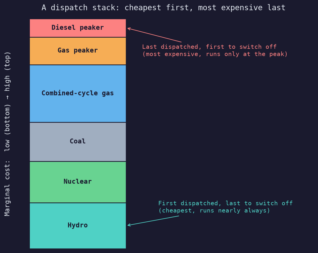 A dispatch stack, cheapest generation first, climbing toward the pricey peakers as demand rises. The units at the bottom are first on and last off; the ones at the top are last on and first off. The fuels here are a generic illustration, Texas leans on wind, solar, nuclear, and gas rather than hydro or diesel.
Wind, solar, and nuclear sit at the bottom. Their fuel costs basically nothing, so they run whenever they can. Gas plants sit in the middle, and how far up depends on how efficient they are (their heat rate, which I got into in the spark spread post). The peakers sit at the top, simple-cycle gas turbines that burn a ton of fuel per unit of power and are expensive to run, so they only get called when the grid is desperate.
The last plant you need to switch on sets the price for everyone. The price tracks that marginal plant, not the average cost of all the plants running. If demand is low and a cheap gas plant is the last one needed, everybody gets paid that low price. If demand is so high that ERCOT has to call a peaker, the price jumps to whatever that peaker costs, and every generator on the grid earns it. That’s marginal pricing, and it’s the heart of how an LMP (locational marginal price) is formed.
So when you watch a Texas price chart spike from $30 to $3,000 in an afternoon, that’s demand climbing the stack, running out of cheap plants and slamming into the steep, expensive top end. The fuel cost barely moved. The grid just ran out of cheap options. When even the peakers aren’t enough, you hit scarcity pricing, where the price rockets toward the cap to beg any remaining supply to show up and any flexible demand to back off.
The stack meets the real grid
That clean staircase is the idealized version. What ERCOT actually runs every few minutes is the same merit order with one big complication bolted on, the transmission grid. The dispatch engine even has it baked into the name, Security-Constrained Economic Dispatch, or SCED (ERCOT, Real-Time Market).
The cheapest plant isn’t always reachable. Power lines have limits, and when cheap generation is stuck behind a congested line, ERCOT has to skip it and dispatch a pricier plant closer to where the demand actually is. That’s dispatching out of merit, and it’s the moment a single statewide price splits into many local ones. Congestion on the wires is what makes ERCOT a nodal market, a different price at each point on the grid, and we’ll watch it show up in the data later.
You can see the merit order in the price record
Plotting price straight against demand sounds like the obvious move, but it doesn’t quite work on ERCOT. Scarcity here is driven by net load, demand minus wind and solar, not raw demand, and I’m not ingesting generation by fuel type yet. A windless evening at moderate demand can be tighter than a breezy peak afternoon.
A cleaner way to see the consequence of the stack is to take every 15-minute price in my dataset, sort them from highest to lowest, and plot them. That’s a price-duration curve, and I pulled it straight from HB_NORTH, about 89,000 intervals over two and a half years.
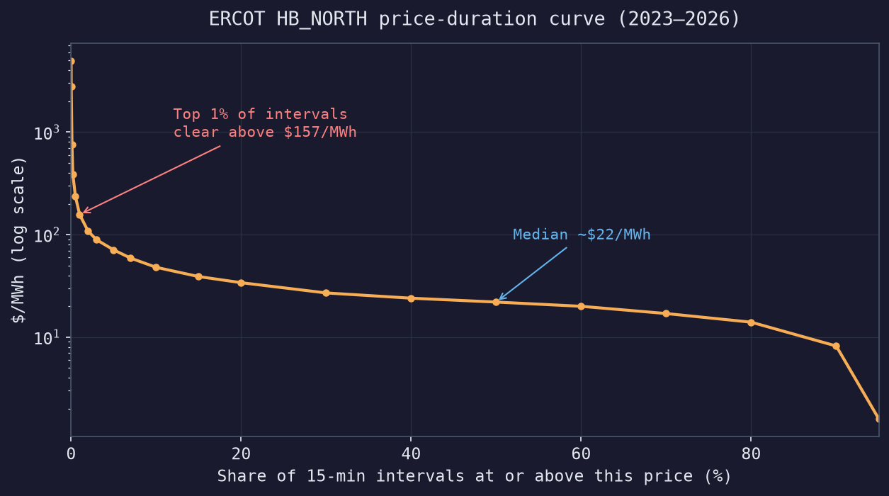
The shape is the whole point. For roughly 90% of the time HB_NORTH sits below $48/MWh, with a median around $22. The grid is parked at the cheap, flat bottom of the stack. Then in the last sliver of intervals the curve goes near vertical. The top 1% clear above $157, the top 0.1% above $760, and the single worst interval in the whole record hit $4,965, almost the system cap.
That vertical cliff is the top of the merit order, and it only gets reached for a tiny fraction of hours, when demand climbs past the cheap plants and ERCOT has to pay whatever it takes to keep the lights on. Almost all of the financial risk in this market lives in those few hours.
The other end is worth a look too. The cheapest intervals go negative, down to about -$66 in this data. So much wind and solar floods the grid that generators would rather pay to keep producing than shut down and restart. The stack runs in both directions.
Those extremes looked wild enough, in both directions, that I wanted to be sure I hadn’t fumbled something on the data engineering side. So I cross-checked the magnitudes against ERCOT’s own published prices and a couple of independent market recaps, and they hold up. Real-time prices really do spike into the thousands during scarcity, right up to ERCOT’s $5,000/MWh cap (ERCOT Market Prices, Modo Energy 2024 recap, gridstatus.io).
The shape of demand
The merit order is only half of “supply equals demand.” The other half is demand, and it rises and falls on a rhythm you can read straight off the load data.
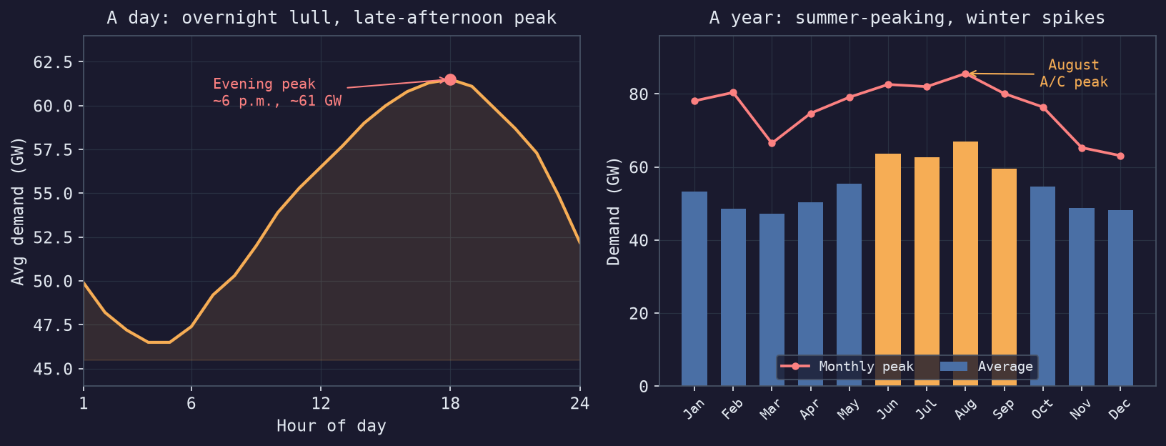 Average ERCOT system demand by hour of day (left) and by month (right), from about 22,000 hourly readings in my lakehouse, 2023 to 2026.
Two patterns jump out. Within a day, demand sags overnight to around 46 GW while everyone’s asleep, then climbs all afternoon to a peak near 6 p.m., about 61 GW on an average day, as offices, homes, and air conditioners pile on at once. Across the year, Texas is a summer-peaking grid. August runs the highest, and the monthly peaks push past 85 GW, almost all of it air conditioning.
Winter is sneakier. The average stays low, but a hard cold snap like February 2026 can spike demand to 80 GW for a few hours, which is exactly how an event like Winter Storm Uri puts the grid on the ropes.
Now line this up with the merit order and it clicks. A summer late afternoon is when demand climbs highest, which is when ERCOT has to reach furthest up the stack into the pricey peakers, which is when prices spike. It’s also, not by coincidence, when those four annual peak intervals land that set big industrial customers’ transmission bills for the year, the 4CP story I got into in the spark spread post.
Two auctions: day-ahead and real-time
There’s a detail I glossed over. ERCOT doesn’t run one market, it runs two, and they happen at different times.
The first is the day-ahead market, the daily auction. The day before each operating day, generators and buyers submit their offers and bids, and ERCOT clears all 24 hours of tomorrow in one shot. Bidding closes at 10 a.m. the day before, and results are posted by 1:30 p.m. (ERCOT, Day-Ahead Market).
Why auction power a day early when there’s a real-time market anyway? Lead time. A big combined-cycle or coal plant can’t start on a moment’s notice, it needs hours to warm up, with fuel and staff lined up ahead. The day-ahead auction tells a generator “you’re running tomorrow afternoon” early enough to actually commit the unit. It’s also financially binding, so it locks in a known price for most of the volume before the day even starts.
The second is the real-time market, and this one never stops. ERCOT re-dispatches the grid every 5 minutes to match what’s actually happening, then settles those prices on 15-minute intervals (ERCOT, Real-Time Market). That 15-minute real-time price is the one I’ve been charting all along.
The clean way to hold the two in your head is that day-ahead is the market’s expectation and real-time is what actually happened. Most power trades day-ahead at a calmer, forecastable price, and real-time just trues up the gap between the forecast and reality. When the two prices tear apart, a plant tripped, the wind died, a heatwave landed early, that’s a forecast getting caught out. Those surprises are exactly the spikes sitting in the tail of the price-duration curve above.
Why this turns into a data problem
Walk back through the three properties now that the market makes sense. High frequency, because the balancing never stops. Volatile, because of the merit order and scarcity pricing. Locational, because the wires between generation and demand have limits.
That’s an awkward shape for data infrastructure, high-volume time-series queried by both time and location, where the events that matter most are rare, extreme, and the ones you can’t afford to miss. The locational piece is the one that surprised me most once I had the data in front of me, so let me show it.
Same grid, different prices
ERCOT settles prices at four main trading hubs, HB_NORTH (Dallas), HB_HOUSTON, HB_WEST, and HB_SOUTH. Texas is enormous, and power can’t cross it for free, so you might expect the four to drift far apart.
Averaged over two and a half years, they barely differ. All four land between $29 and $30/MWh. Most of the time the grid is connected well enough that where you sit hardly matters.
The locational story lives in the tails. Watch how often each hub’s price drops below zero.
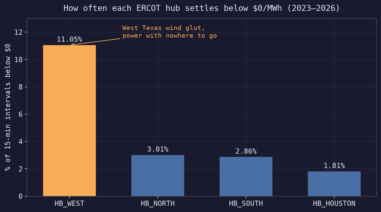
HB_WEST settles negative about 11% of the time, more than three times as often as any other hub. That’s West Texas wind. The region built enormous wind capacity, but there’s only so much transmission to carry it east to the cities, so when the wind blows hard, power piles up locally with nowhere to go and the price falls through zero. Wind farms will even pay to stay online, since federal production tax credits reward them for every megawatt-hour they generate, so bidding below zero can still pencil out (EIA).
Houston is the mirror image. It’s the priciest hub on average and the least likely to go negative, because it’s a dense load pocket, lots of demand and limited ability to pull power in. Same state, same instant, opposite problems. That spread between West Texas and Houston is congestion, and it’s what makes this a spatial problem sitting on top of a time-series one.
Running it on Databricks Free
Every number and chart in this post came out of a small lakehouse I put together on the Databricks Free Edition. I pull ERCOT’s public API into bronze, clean it into silver, and roll it up into the gold tables behind these charts, all through Lakeflow declarative pipelines.
This is still early days for me in power markets. I came in comfortable with the data engineering and I’m learning the domain as I go, so if I’ve mangled some ERCOT nuance, tell me.
Thanks for reading 🙂